 NG-ZORRO
Theme Customization
Ant Design allows you to customize some basic design aspects in order to meet the needs of UI diversity from business and brand, including primary color, border radius, border color, etc.
We are using Less as the development language for styling. A set of Less variables are defined for each design aspect that can be customized to your needs.
You can use the theme define file of react version in ng-zorro-antd too.
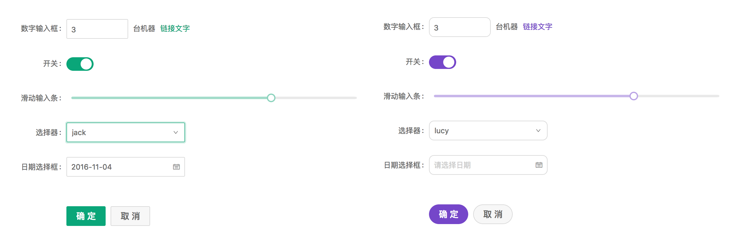
Use Pre-defined Themes#
Customize the theme#
- Configure with schematics. Run
ng add ng-zorro-antd, choose not to set up custom theme file and yourangular.jsonwill be configured automatically:
{
  "build": {
    "options": {
      "styles": ["./node_modules/ng-zorro-antd/ng-zorro-antd.min.css"]
    }
  }
}
You can also add this config manually in angular.json.
Official Themes#
Besides the default theme, we have provided 3 more official themes. Please try them out and give us feedbacks.
- 🌑 Dark Theme
- 📦 Compact Theme
- ☁️ Aliyun Theme
Method 1: Less#
Import ng-zorro-antd.less, ng-zorro-antd.dark.less, ng-zorro-antd.compact.less or ng-zorro-antd.aliyun.less in the style file and override style variables.
// Import the official default less style file
@import '~ng-zorro-antd/ng-zorro-antd.less';

// Import the official dark less style file
//@import "~ng-zorro-antd/ng-zorro-antd.dark.less";

// Import the official compact less style file
//@import "~ng-zorro-antd/ng-zorro-antd.compact.less";

// Import the official Aliyun less style file
//@import "~ng-zorro-antd/ng-zorro-antd.aliyun.less";
Method 2: CSS#
If the project does not use Less, you can include ng-zorro-antd.css, ng-zorro-antd.dark.css, ng-zorro-antd.compact.css or ng-zorro-antd.aliyun.css in the CSS file or add to the angular.json config.
CSS file:
@import '~ng-zorro-antd/ng-zorro-antd.css';
/*@import "~ng-zorro-antd/ng-zorro-antd.dark.css";*/
/*@import "~ng-zorro-antd/ng-zorro-antd.compact.css";*/
/*@import "~ng-zorro-antd/ng-zorro-antd.aliyun.css";*/
In angular.json:
{
  "build": {
    "options": {
      "styles": ["node_modules/ng-zorro-antd/ng-zorro-antd.css"]
    }
  }
}
Customize Pre-defined Theme#
Method 1: Override style variables in Less#
Import pre-defined theme file#
Import pre-defined theme file in the src/styles.less (or run ng add ng-zorro-antd, choose to set up custom theme automatically):
// Custom Theming for NG-ZORRO
// For more information: https://ng.ant.design/docs/customize-theme/en
@import "../node_modules/ng-zorro-antd/ng-zorro-antd.less";
...
Customize style variables#
After importing the theme file, override the values of theme style variables based on the project requirements. For example, the demo below illustrates how we can override the ng-zorro-antd default theme's @primary-color to #f5222d:
// -------- import official less file -----------
@import '../node_modules/ng-zorro-antd/ng-zorro-antd.less';

// -------- override less variables -----------
@primary-color: #f5222d;
Method 2: Override theme variables in webpack#
Override by pre-defined theme variables#
Using less-loader in webpack if needed:
const darkThemeVars = require('ng-zorro-antd/dark-theme');
const compactThemeVars = require('ng-zorro-antd/compact-theme');
module.exports = {
  module: {
    rules: [
      {
        test: /\.less$/,
        loader: 'less-loader',
        options: {
          modifyVars: {
            hack: `true;@import "${require.resolve('ng-zorro-antd/style/color/colorPalette.less')}";`,
            ...darkThemeVars,
            ...compactThemeVars
          },
          javascriptEnabled: true
        }
      }
    ]
  }
};
Override by customized style variables#
Angular CLI provide custom-webpack-builder, you can modify the less variable via adjusting the less-loader options in webpack.
Import
ng-zorro-antd.lessinangular.json{ "styles": ["node_modules/ng-zorro-antd/ng-zorro-antd.less"] }Install
@angular-builders/custom-webpackbuildernpm i -D @angular-builders/custom-webpackcreate
extra-webpack.config.jsmodule.exports = { module: { rules: [ { test: /\.less$/, loader: 'less-loader', options: { modifyVars: { // modify theme variable 'primary-color': '#1DA57A', 'link-color': '#1DA57A', 'border-radius-base': '2px' }, javascriptEnabled: true } } ] } };Customize builder in
angular.json"architect": { "build": { - "builder": "@angular-devkit/build-angular:browser", + "builder": "@angular-builders/custom-webpack:browser", "options": { + "customWebpackConfig": { + "path": "./extra-webpack.config.js", + "mergeStrategies": { + "module.rules": "append" + }, + "replaceDuplicatePlugins": true + } }, }, "serve": { - "builder": "@angular-devkit/build-angular:dev-server", + "builder": "@angular-builders/custom-webpack:dev-server", } }
You can get more information about custom-webpack builder following the articles
- Angular Builder Document
- Angular CLI: Custom webpack Config
- Customize Webpack Configuration in Your Angular Application
All less variables can be viewed here is a sample of theme define file.
Theme Dynamic Switching#
We have prepared you a demonstration project illustrating how theme dynamic switching works, you can check it out here.
Configure angular.json file#
Style preprocessor option
stylePreprocessorOptionsAdd path in a style preprocessor option called
stylePreprocessorOptionsinangular.json:"stylePreprocessorOptions": { "includePaths": [ "src/path-to-mixin" ] },As such, this config allows you to import
.themeMixin(@rules)definition file which is undersrc/path-to-mixinpath anywhere in the project without the need of using relative path:// A relative path works @import 'src/path-to-mixin/mixin'; // But now this works as well @import 'mixin';bundleNameandinjectin stylesIf you intend to dynamically switch the pre-defined themes at runtime, you would need to configure every theme's bundling strategy for the bundler. For example, if your app has default and dark themes, the
stylesoption ofangular.jsonneeds to be configured as below:"styles": [ "src/styles.less", { "input": "src/styles/default.less", "bundleName": "default", "inject": false }, { "input": "src/styles/dark.less", "bundleName": "dark", "inject": false } ],
bundleName refers to the CSS bundle filename which is used for the href attribute in link tag for switching the pre-defined themes in the later section. inject's default value is true, which the bundle is injected by default. For the purpose of theme dynamic switching, you need to set it to false to exclude the bundle from injection.
Customize theme stylesheets#
In the context of multiple themes, every theme is supposed to have its own style entry file. For better project manageability, we also recommend you to put all relevant theme entry files under src/styles path. For a project with default and dark themes, your project styles can be in the following structure:
  src/styles
  ├── dark.less
  ├── default.less
  └── themes
      ├── base.less
      ├── dark.less
      ├── default.less
      └── mixin.less
Stylesheets under src/styles/ are entry files which are used to import the pre-defined official entry file as well as theme customization stylesheets under src/styles/themes/. For example, src/styles/dark.less entry file contains the following lines:
@import '../../node_modules/ng-zorro-antd/ng-zorro-antd';
@import './themes/dark';
Accordingly, src/styles/themes/dark.less is in charge of customizing dark theme:
@import (multiple) '../../../node_modules/ng-zorro-antd/src/style/themes/dark';
@import './base';

@layout-sider-background: @component-background;
@layout-header-background: @component-background;
The theme filename that you define can be identical to corresponding pre-defined theme filename. In such cases,
@import '<url>';has no effects. Less provides us a solution to this circumstance which usesmultiplemethod to import.lessfiles with identical filenames, i.e.@import (multiple) '<url>';.
Note that if there exists common style variables for all themes, you should create a base.less stylesheet and import it in every theme customization stylesheet:
// base.less customizes common style variables
@margin-md: 17px;
...
Switch themes#
Switching themes involves two parts. First is switching the project component theme, and the other is switching the pre-defined theme.
Switching component theme#
The default encapsulation policy of Angular for the template and CSS styles is ViewEncapsulation.Emulated, also known as shimmed CSS that emulates the native behavior. Based on different encapsulation policy, Angular will package component styles into a JS file in different ways.
However, it is troublesome to define styles in the following format:
html {
  &.default {
    @import 'default';
    // Component styles
    ...;
  }
  &.dark {
    @import 'dark';
    // Component styles
    ...;
  }
}
Be noted that the configured path in the style preprocessor option
stylePreprocessorOptionsallows you to import file without the need of relative path.
A better way to achieve this is to define a Mixin called .themeMixin(@rules) in the mixin.less file mentioned above:
.themeMixin(@rules) {
  html {
    &.default {
      @import './default.less';
      @rules();
    }
    &.dark {
      @import './dark.less';
      @rules();
    }
  }
}
Then, wrap all the component styles in the .themeMixin(@rules):
@import 'mixin'; // Similarly, no need for relative path

.themeMixin({
  :host {
    // Component styles
    ...
  }
});
Switch pre-defined theme#
Loading a pre-defined theme file can be achieved by dynamically creating a link tag, append it on the DOM and remove previous tag.
private loadCss(href: string, id: string): Promise<Event> {
  return new Promise((resolve, reject) => {
    const style = document.createElement('link');
    style.rel = 'stylesheet';
    style.href = href;
    style.id = id;
    style.onload = resolve;
    style.onerror = reject;
    document.head.append(style);
  });
}
href here refers to the path of the bundle name, i.e. bundleName.
Synchronize the style switching#
Project component styles will be packaged into a JS file which take effects immediately while switching themes via html className. On the other hand, it takes time to dynamically load the CSS theme file. If you attempt to perform two actions simultaneously, project styles will change immediately whereas styles of the pre-defined theme remain unchanged until the CSS theme file is fully loaded, resulting two themes mixing on the web page. As such, you must wrap the loading CSS process in a Promise and force the className switching to wait until the former completely finishes.
private removeUnusedTheme(theme: ThemeType): void {
  document.documentElement.classList.remove(theme);
  const removedThemeStyle = document.getElementById(theme);
  if (removedThemeStyle) {
    document.head.removeChild(removedThemeStyle);
  }
}

loadTheme(firstLoad = true): Promise<Event> {
  const theme = this.currentTheme;
  if (firstLoad) {
    document.documentElement.classList.add(theme);
  }
  this.loadCss(`${theme}.css`, theme).then(
    e => {
      if (!firstLoad) {
        document.documentElement.classList.add(theme);
      }
      this.removeUnusedTheme(this.previousTheme);
      resolve(e);
    },
    e => reject(e)
  );
}
Note: First-time loading of the user-defined default component theme must be performed immediately or there is a short period of time the app has no class of theme.